Where you live in Atlanta affects life expectancy
Where you live in metro Atlanta can determine how long you live.
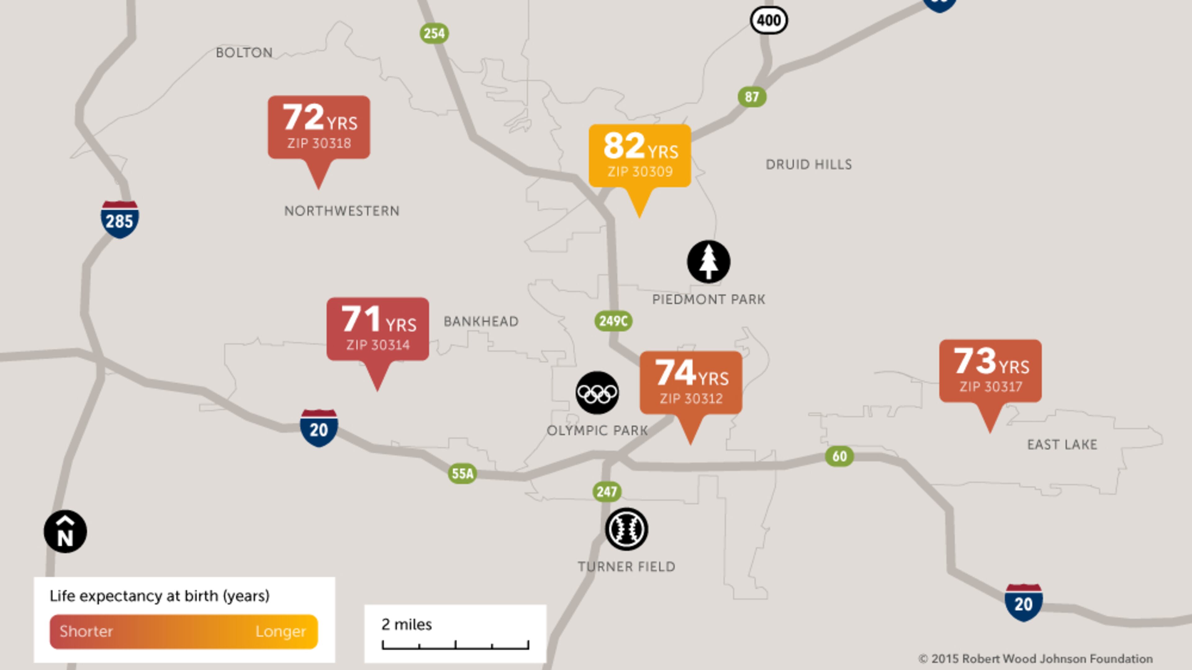
A new life expectancy map released Wednesday shows that babies born a few miles apart in Atlanta might have lifespans that differ by 12 years.
The map was created by the Virginia Commonwealth University (VCU) Center on Society and Health with funding from the Robert Wood Johnson Foundation. It is intended to raise public awareness of the factors that influence health.
Those factors are complex, but location can play a big role, affecting opportunities for education and jobs, safe and affordable housing, availability of nutritious food and places for physical activity, clean air, and access to health care, child care, and social services.
According to the research, residents of Buckhead, zip code 30305, had an average life expectancy of 84 years, compared to northwest Atlanta residents just a few miles away, in area code 30318, with a life expectancy of 72 years.
The center constructed maps for Atlanta, Chicago, Las Vegas, New York and Richmond. Maps of 14 more cities are planned for the coming months.
The foundation points out that the Atlanta Regional Collaborative for Health Improvement (ARCHI) — a partnership of hospital, public health, local government, regional planning, academic, non-profit and philanthropic groups — is already working to ameliorate those differences.
For more information and to view life expectancy maps of other cities go to the VCU Center on Society and Health.
About the Author