Georgia Tech introduces Adidas gear, word mark, gold shade

When Georgia Tech’s athletic department sought to create a uniform word mark for its uniforms, gear and the like, the process looked back and up.
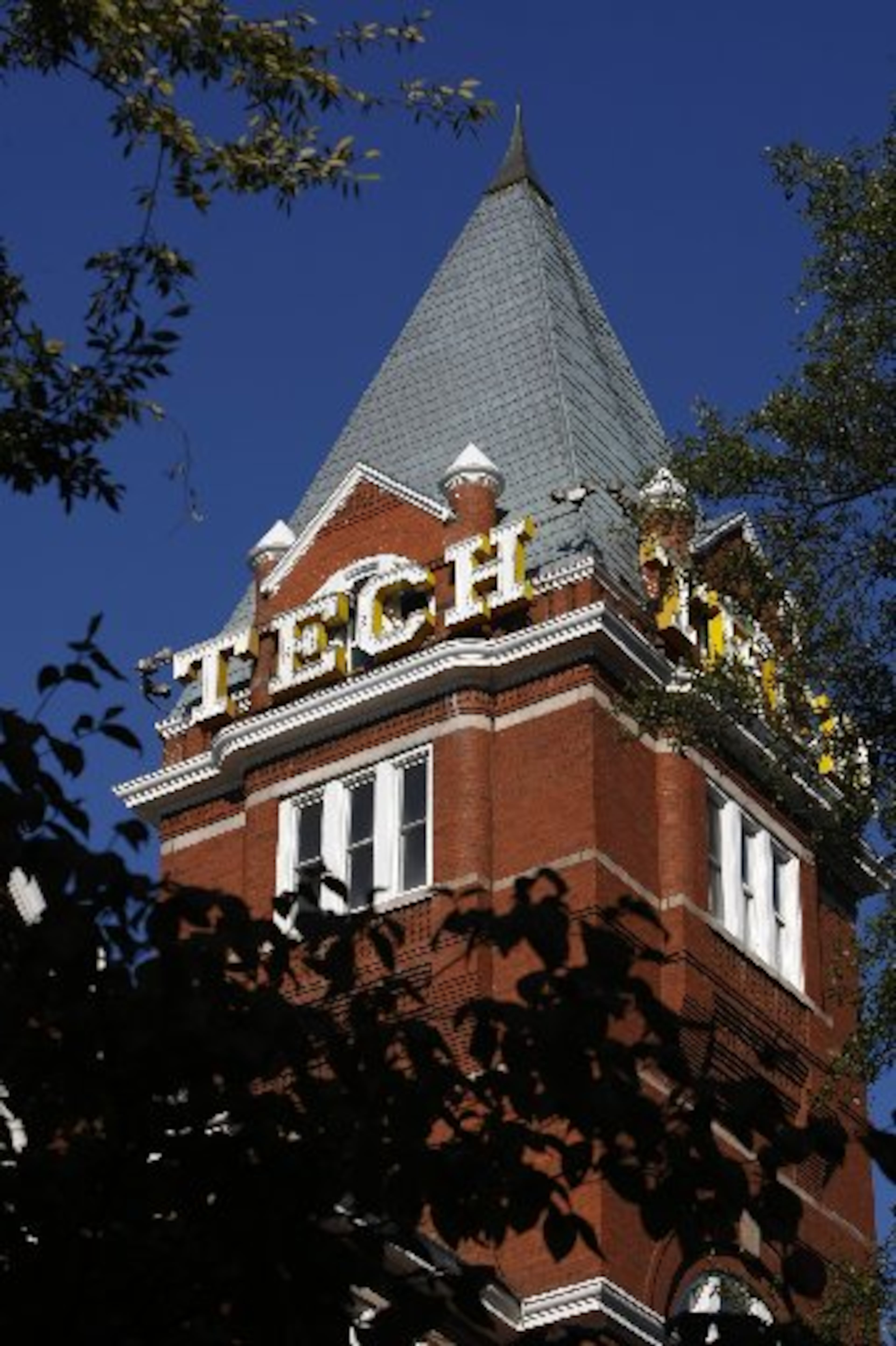
Back into the school’s history and up to its iconic Tech Tower. The new word mark, debuted Friday through the athletic department’s website and social media and in the form of new Adidas merchandise, took its inspiration from the lettering of the word “Tech” that hangs on all four faces of the seven-story tower.
“I think everything kept pointing us back to Tech Tower,” said Brad Malone, Tech’s director of brand and ideation. “That’s certainly a very old-school college-type font, but we also knew we had to make it modern. That’s where you see the blend there.”
Malone spearheaded Tech’s efforts to select a word mark for the athletic department – the first it has ever created – and a shade of gold that it will use for uniforms and apparel.
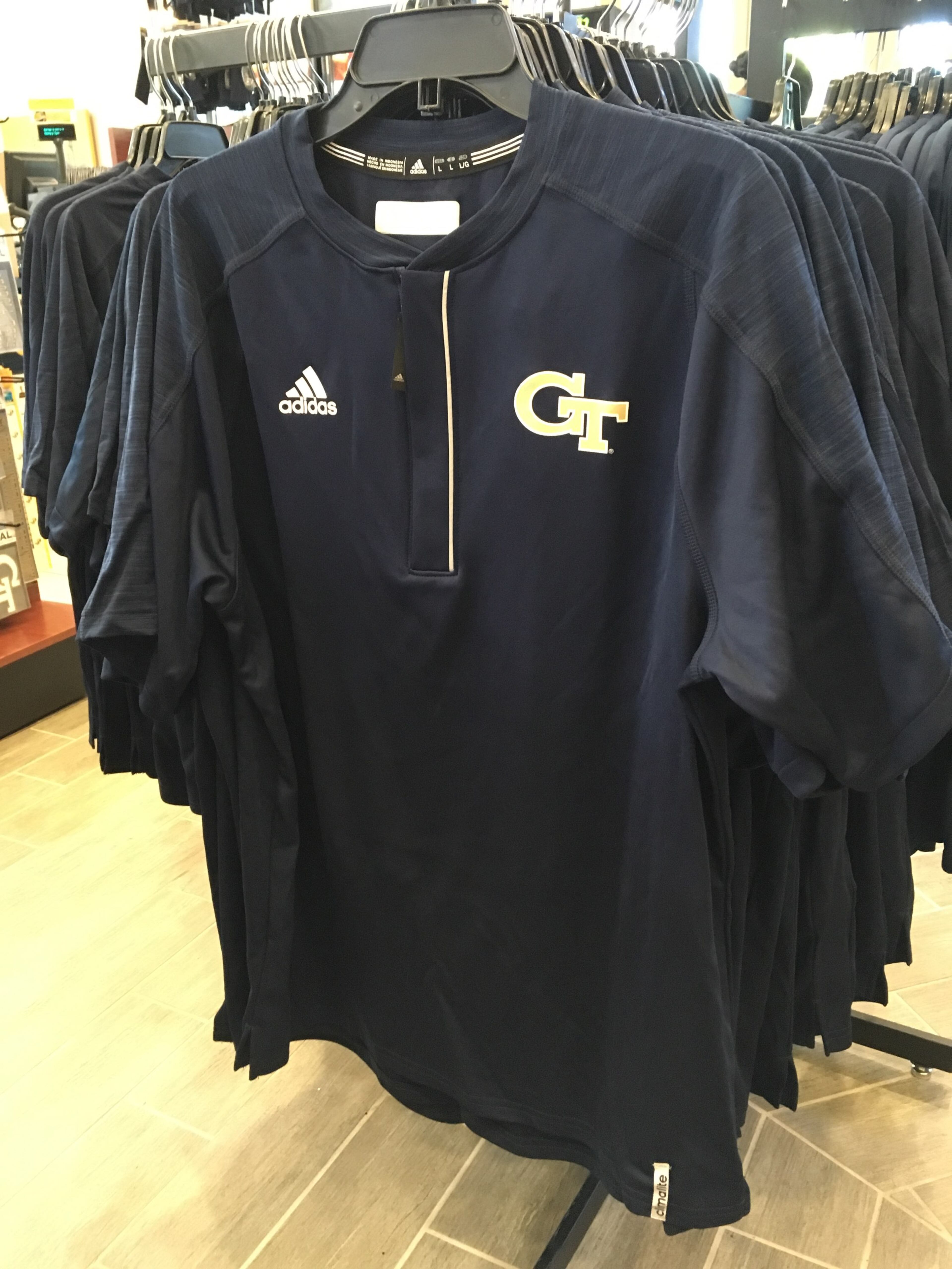
At the same time, an initial batch of Tech gear produced by new apparel provider Adidas went on sale Friday morning at the Barnes & Noble bookstore near campus. The collection of T-shirts and polos is emblazoned with the new word mark created by the athletic department with Adidas and colored with the “Tech Gold” that was selected to be used for uniforms and apparel.
The store had about 10 items on display at the entrance, ranging from hats and visors ($24 each) to T-shirts and a gold polo shirt made from Adidas’ “Climachill” fabric ($80). The same apparel also was to be put on sale at the football team’s spring game Friday night at Bobby Dodd Stadium.
Fans responded enthusiastically on social media to the gear, the first pieces of Tech apparel that Adidas has produced since the company agreed to be the apparel provider for the athletic department in August.
The word mark, a design that has been in the works since last May, will give the department and its teams a long-sought consistency in branding. (Keen-eyed observers may notice that the numbers marking the yard lines on Grant Field have been painted in a font echoing the word mark.)

The athletic department collaborated with NFL vice president for brand and creative Jaime Weston, a Tech alumna and a former Jackets volleyball player, and sought feedback from focus groups, alumni, students, athletes and fans.
“A lot of cases, whether it’s ‘SportsCenter’ or whatever it may be, it’s a fleeting image,” athletic director Todd Stansbury said, “and especially as we look at extending our footprint from a recruiting standpoint, I think that consistency becomes really important, because you want to make sure that a potential recruit in Seattle, Washington, whether they see the ‘GT’ or a certain gold or look or whatever, that they know who we are.”
The T, E and C in the word mark, particularly the T, were inspired by the tower’s lettering. The sleekness of the font was designed to evoke the school’s innovative bent, particularly in the design of the G, R and H, whose pointed serifs are also a nod to the stingers of Yellow Jackets.

The Tech Gold (Pantone 4515 C) is based on the paint scheme of the Ramblin’ Wreck and also has a metallic version (Pantone 8383 C). The institute has also adopted the two gold shades.
The department has also reduced its variety of interlocking “GT” logos from 40 to 8, images that are displayed anywhere from television graphics to apparel to uniforms. They will use gold or white only with backgrounds of gold, white or blue. Eliminated versions also incorporated yellow, which has caused confusion about whether it was an official school color (it is not).
In that streamlining, whenever Buzz is used as a logo, he will be gold and blue and not black and yellow. The actual mascot costume will remain the same.


