Fresh coat of paint can create clean slate

One way to escape the winter doldrums is to get a jump on spring by adding a fresh coat of paint, inside and out. Whether it’s to perk up an outdated décor or to create a clean slate in time for the spring home-selling market, new paint can be a game changer to a room or an exterior.
And that poses the question: Is there a color that will appeal to buyers and give the house a sense of cutting-edge style? Sue Wadden, director of color marketing for Sherwin-Williams, has a full-time job finding the answer. She also gets to name the colors the paint company comes up with and predict what’s going to be the next trend.
“Naming the colors is super fun,” she said with a laugh. “I also have a forecast team that talks about what we’re seeing in education, politics, art and design that influences color. You really do see patterns, and usually specific ones begin to emerge. Usually there’s a connection point to one key color.”
This year, Wadden calls that key color “poised taupe,” a neutral shade that’s usurping the popularity held by grays and slates for some time.
“Forecasters aren’t talking about gray at all; I think we’re coming out of that phase,” said Wadden. “Poised taupe signifies a shift to something warmer, something closer to a mushroom brown. It’s actually a combination of gray and brown, a little darker than the average neutral. It’s rather rich and is really versatile. It can be used in kitchens, baths or man caves. It takes on the character of the space it’s in.”
Wadden isn’t ready to say that grays are disappearing completely, but she does see them as part of a cycle. “The gray phenomenon was an interesting change from the early 2000s when all new construction was [painted] builder beige,” she said. “We were ready for something new, and we started seeing the masculine, industrial styling that became really popular – lots of metal, stainless, distressed, rusted looks. Things took on an industrial cast, and we saw gray come out of the shadows. Now we’re seeing warmer colors coming into the cycle. Natural creams, ecrus and khakis will be important neutrals as part of the urban chic.”
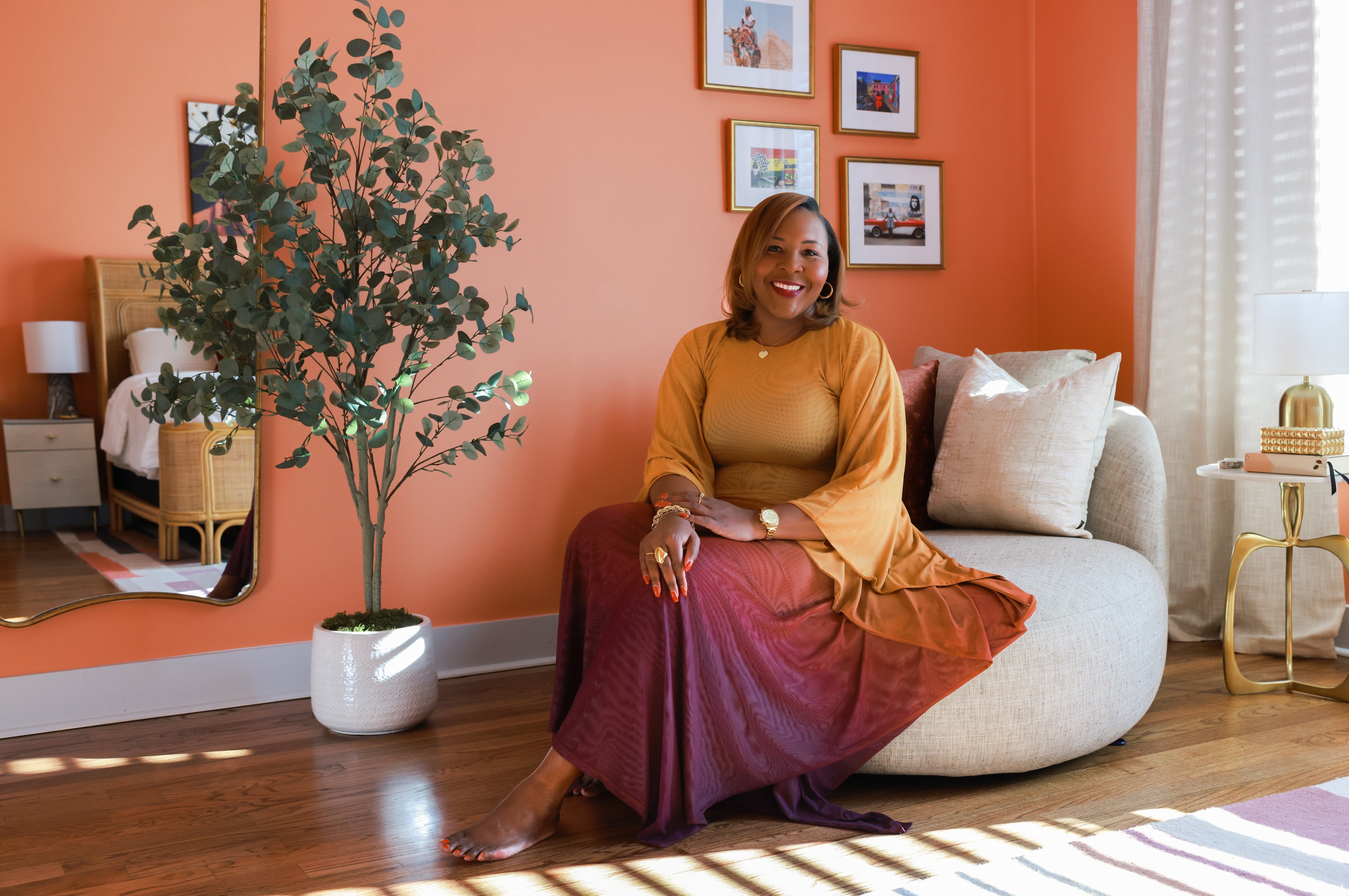
At the same time, jewel tones and brighter shades are finding a following as accent colors. Citrus yellow, pink and orange are turning up on walls, brick accents, fireplace surrounds and window panes.
“These are what I’d call key colors,” said Wadden. “They’re great as a pop up or on an accent wall, but people might have a hard time using them as all-over color.”
Wadden and her team have also noted a resurgence of rich jewel tones, particularly in the kitchen.
“I was at a builder show a few weeks ago, and hands down, white painted cabinets are still a staple,” she said. “Three years ago, 75 to 80 percent of their cabinets were stained; now it’s 80 percent painted white, but navy blues and reds are also showing up as homeowners are embracing color in their kitchens again.”
That choice may be a reflection of other shifts taking place in the country that make homeowners crave a living space that’s also a haven or warmth and welcome, Wadden said.
“Yes, I think there’s a little bit of politics going on here. There’s a need to look inward, to create a home that’s comfortable and safe, and those rich, dark colors — charcoals, evergreens and rubies - offer a calming vibe. You can settle into your cozy space and decompress. There are many trends around slow living and finding a space that’s peaceful, and that’s gaining momentum by leaps and bounds. ”

