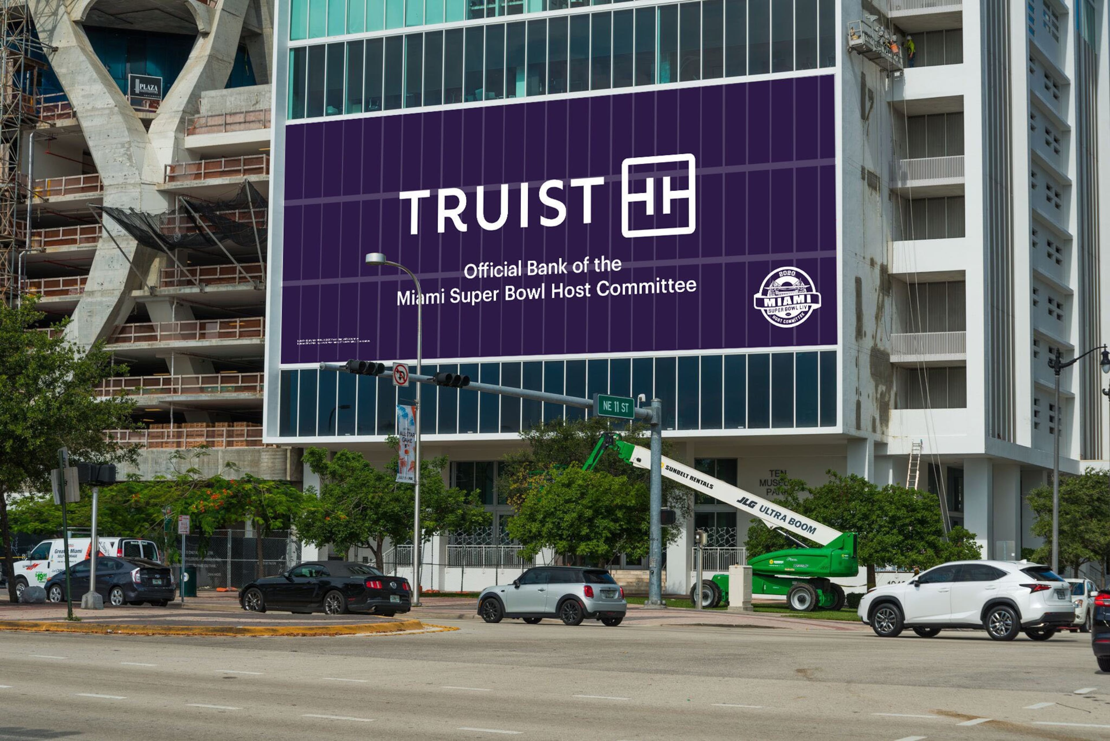
SunTrust successor Truist rolls out new purple brand design and logo

Editor’s note: This article has been updated with additional details throughout.
SunTrust’s familiar blue-and-orange logo is being ditched for the purple design of its new company’s brand name, Truist.
The new look, unveiled Monday, follows the move of the 128-year-old Atlanta bank's headquarters to Charlotte, N.C. That's where Truist is based after SunTrust merged with Winston-Salem, N.C.'s BB&T last month to create the country's sixth-largest bank.
Even more changes are on tap for Tuesday, when the specific new name for the Atlanta Braves' stadium will be released. The team had already said SunTrust Park would get a new name, but the exact wording has not been disclosed.
For Atlantans, the Truist name will only appear gradually. Signs will be replaced and branch offices renovated with the new Truist color scheme over a period of 18 to 24 months, the company said. Consumers will receive new debit and credit cards emblazoned with Truist purple in the same time frame.
Truist also reiterated Monday it doesn’t plan to close any bank branches in Atlanta or elsewhere for at least a year, despite the proximity of some SunTrust and BB&T locations.
The gradual switchover gives consumers time to get used to the new name and colors after generations of Atlantans grew up with SunTrust - and maybe also win over critics who panned the Truist name when it was first revealed last summer.
Before the merger with BB&T closed last month, SunTrust was metro Atlanta’s largest bank in deposits and number of branches. But BB&T also had a sizeable presence, ranking fourth by both measures.

Truist will showcase its new brand during Super Bowl events in Miami this year, although not necessarily in the form of a television advertisement, the company said. Truist declined to provide more details on its time frame for rolling out the new brand.
Truist took great pains to devise a new brand identity, with the help of the New York marketing firm Interbrand, that “leverages the history of the two brands” SunTrust and BB&T, Dontá Wilson, chief digital and client experience officer, said in an interview.
Purple is a combination of SunTrust’s blue and BB&T’s burgundy. And the logo, made from two T letters lying on their side, reflects the two Ts in the Truist name.
The announcement last summer of its new name landed with somewhat of a thud. Atlanta consumers critiqued Truist as a made-up word that lacked any meaning.
Baseball fans seemed especially disgusted with the name, as 3,100 baseball-related mentions of Truist across multiple social-media platforms since the June announcement have been overwhelmingly negative, according to the media tracking firm Meltwater. On Twitter, two of the three highest-engagement postings about Truist in relation to baseball were also negative, Meltwater said.
Broad consumer engagement with the Truist name on social media sites has also been critical, although not as sharply as baseball-related content.
“The Truist name has not been well received by the baseball community, or the social media universe at large,” said John Box, an executive vice president at Meltwater.

With its new purple color scheme, Truist has even more work to do in explaining to the public what the Truist brand means, said Gina Bleedorn, chief experience officer at the Atlanta marketing agency Adrenaline. The new design appears plain, spare or even “soulless,” she said.
“There’s a lack of personality,” said Bleedorn, who did not work on the Truist branding project. “Truist has some storytelling to do to give it some personality.”
It’s obvious that Truist had its digital identity at top of mind, Bleedorn said. The plain logo was clearly designed to be distinctive among the app icons on consumers’ smartphones. And purple is a color scheme that’s rarely used by banks or financial services companies, which should give Truist a nice advantage, she said.
“They can own this color,” Bleedorn said. “Purple, psychologically, makes you think of wisdom, or maybe power and royalty.”
However, Truist’s new logo is so basic that it closely resembles several other logos, including those of Tyler Perry Studios and the fashion designer Tory Burch, Bleedorn said. That might have been intentional, to evoke the feeling in consumers that they have seen the logo somewhere before and are comfortable with it.
“Maybe they are trying to be all things to all people,” she said.
When asked about the resemblance to other logos, Wilson, the Truist executive, said, “We did a lot of great research to make sure the logo is differentiated and that it shows up in a special way.”
Truist is already tied up in court over its new name, as a North Carolina credit union named Truliant has sued Truist for trademark infringement. Before Monday, Truist had shared a confidential copy of its new logo with the credit union to prove how it's different. Truliant's colors are blue and yellow, but the credit union said on Monday that it has no plans to drop its lawsuit.
“Their infringement is about more than a visible corporate logo,” Truliant’s president, Todd Hall, said in a emailed statement on Monday. “We see difficulty for consumers distinguishing between our names being led down the wrong path.”
What happens to the SunTrust Park name?
The Atlanta Braves and Truist will hold a press conference Tuesday to announce the new name of the Braves’ stadium. The team had already said SunTrust Park would get a new name, but the exact wording has not been disclosed. SunTrust merged with BB&T last month to form a new bank, Truist.
More Stories
The Latest


