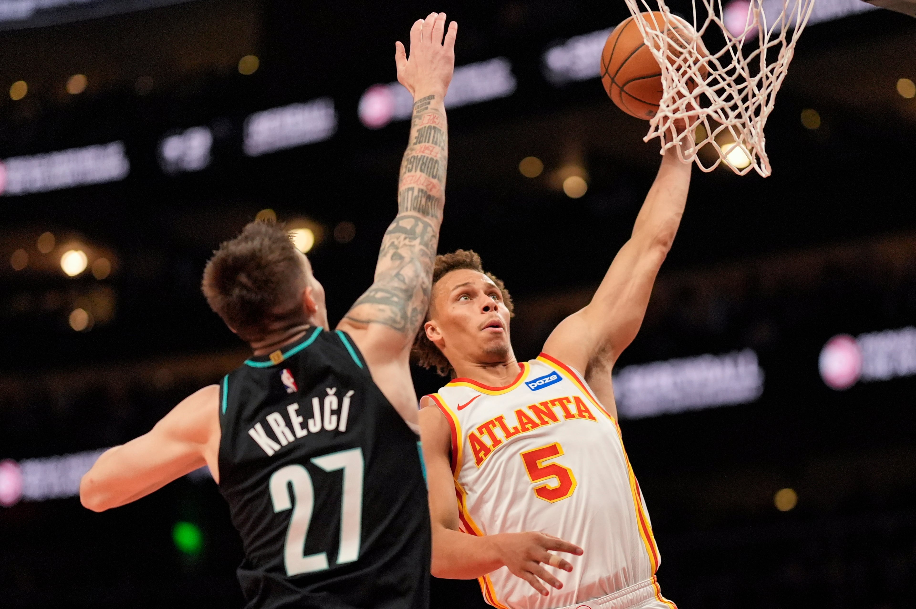
Hawks’ new uniforms got big assist from players
Internally, the Hawks call it the “evolved” Pac Man.
The redesigned franchise logo honored the past and was the impetus for an expedited journey to redefine and rebrand the Hawks for the future. The team created a new color scheme, logos and uniforms as a means to that end.
“The Atlanta Hawks got a whole lot cooler this year,” guard Kyle Korver said in June when the uniforms were unveiled.
The Hawks completed a uniform change process in about eight months when such a venture can typically take between one and two years. It started with a simple conversation between CEO Steve Koonin and Senior Vice President of Marketing and Chief Creative Officer Peter Sorckoff. What followed was a series of complexities that involved the entire organization and the NBA.
The final results caused quite a stir: Volt Green. You either love it or hate it.
The Hawks kept one color, renamed Torch Red, which is the exact same color palette from the team’s beginning in St. Louis. It will remain the primary color and you will rarely see the new Pac Man logo in any other color. They added Georgia Granite Gray and Volt Green, a variation of the color the team wore several years after relocating to Atlanta in 1969.
The new uniforms have three options with red, gray and white predominate and were designed to be mixed and matched. The team also introduced a feather pattern that will be displayed on the uniforms, court and even company letterhead and supplies.
“I really didn’t feel the previous uniforms, they really didn’t make a statement about us one way or another,” said Sorckoff, who led the process. “They aren’t bad by any stretch. I don’t know if they are any good by any stretch either. They are somewhere in the middle. Nobody hates them but nobody loves them.
“As (Koonin) and I got talking more and more about reconstituting the brand and what it was going to represent, the visual identity is then the next extension when you get positioning correct and really establish what you’re value system is going to be.”
One of the Hawks’ new principles is innovation as they focus on an audience of multi-cultural millennials. The team unveiled the redesigned Pac Man logo to great acceptance and fanfare in 2014 as a variation of the icon from 1972-1995. Sorckoff admitted some trepidation but thought the logo would be well-received. It was.
While the organization worked on the new color scheme and uniform design, it turned to its players for their input. It turned out to be an essential move.
Sorckoff said the colors were decided upon fairly early in the process. Last September, he took the colors and uniform design to some players for their opinion. It opened another door of cooperation and players had a significant voice.
“If our audience is this multi-cultural millennial, we have a bunch of them sitting in the locker room as a case study essentially,” Sorckoff said. “More importantly, that same group is going to be our thought-leaders when we go to market with this. If there is an authentic and organic validation with them, then we have a much better chance of it being believable with Hawks fans.”
The players went far beyond the colors. They wanted the uniforms to be functional. Korver requested a thin shoulder strap as not to impede his shooting motion. Al Horford and Paul Millsap wanted to know if something could be done about fabric bunching around their middle which gave opponents an easy grab point in the lane.
When the team gathers on Sept. 28 to kick off training camp, there will a new uniform fitting procedure for them to, within league rules, customize the look and feel.
If the original idea was to bring back the Pac Man logo, then why not just bring back those old uniforms? The answer, Sorckoff said, lies in philosophy that the organization is building something new, starting with the on-court product led by coach Mike Budenholzer and the basketball operations staff to the fan base.
“Why would I make this generation of players wear something that really belonged to a different era?” Sorckoff asked. “If I was a guy playing today, I don’t mind wearing that (throwback) on occasion. It’s really cool. But to cast me in the image of the team that existed 25 years ago, I just wasn’t comfortable with.
“So much of this is making sure we honor today’s athletes and what Bud is doing. Frankly, it’s working. I really believe what he is creating is very sustainable. He and (general manager) Wes (Wilcox) talk about that all the time. They absolutely deserve something that belongs to them. Twenty-five years from now, people will remember this uniform as it relates to Al Horford, Jeff Teague, Paul Millsap and Kyle Korver and so on.”
Sorckoff sought input from the University of Oregon which has worked with Nike on innovative uniforms that have caught national attention and have become one of the school’s most important recruiting tools.
It won’t be the marketing department but likely the players who will decide on when and what uniforms will be worn, with some league consideration, and whether they will mix jerseys and shorts. The new look also includes socks. The NBA will have new socks this season that can match uniforms. While other teams will design new socks, the Hawks did so as they were designing new uniforms.
Shoelaces will also be a part of what the players can incorporate. Sorckoff said Adidas, Nike and Under Armour are all coming out with existing basketball shoes in the Hawks’ new color scheme.
Sorckoff said the team’s new look was meant for Atlanta. With apologies to those in other cities, he couldn’t care less if they approve or not. He also made it clear the younger generation was the target.
The Hawks set a merchandise sales record at their draft party two years ago with the redesigned Pac Man logo. The record didn’t stand long. Sorckoff said sales figures were six times higher at this year’s draft party with new color scheme merchandise.
“(Koonin) said to me, ‘Peter, if there are not people out there who hate what you guys have created, then you didn’t push it far enough,’” Sorckoff said. “We weren’t pushing for the sake of pushing but we understood that we needed to find a way to step out and stand out and really represent the people. This was a new enterprise. With a new position and a brand that was tilted for a more defined audience, the idea is partly, strategically, if we appeal to a younger set, as with anything in life, if young people like it, older people gravitate toward it.”
More Stories
The Latest


