Atlanta tastemakers react to a color of the year that isn’t, well, colorful

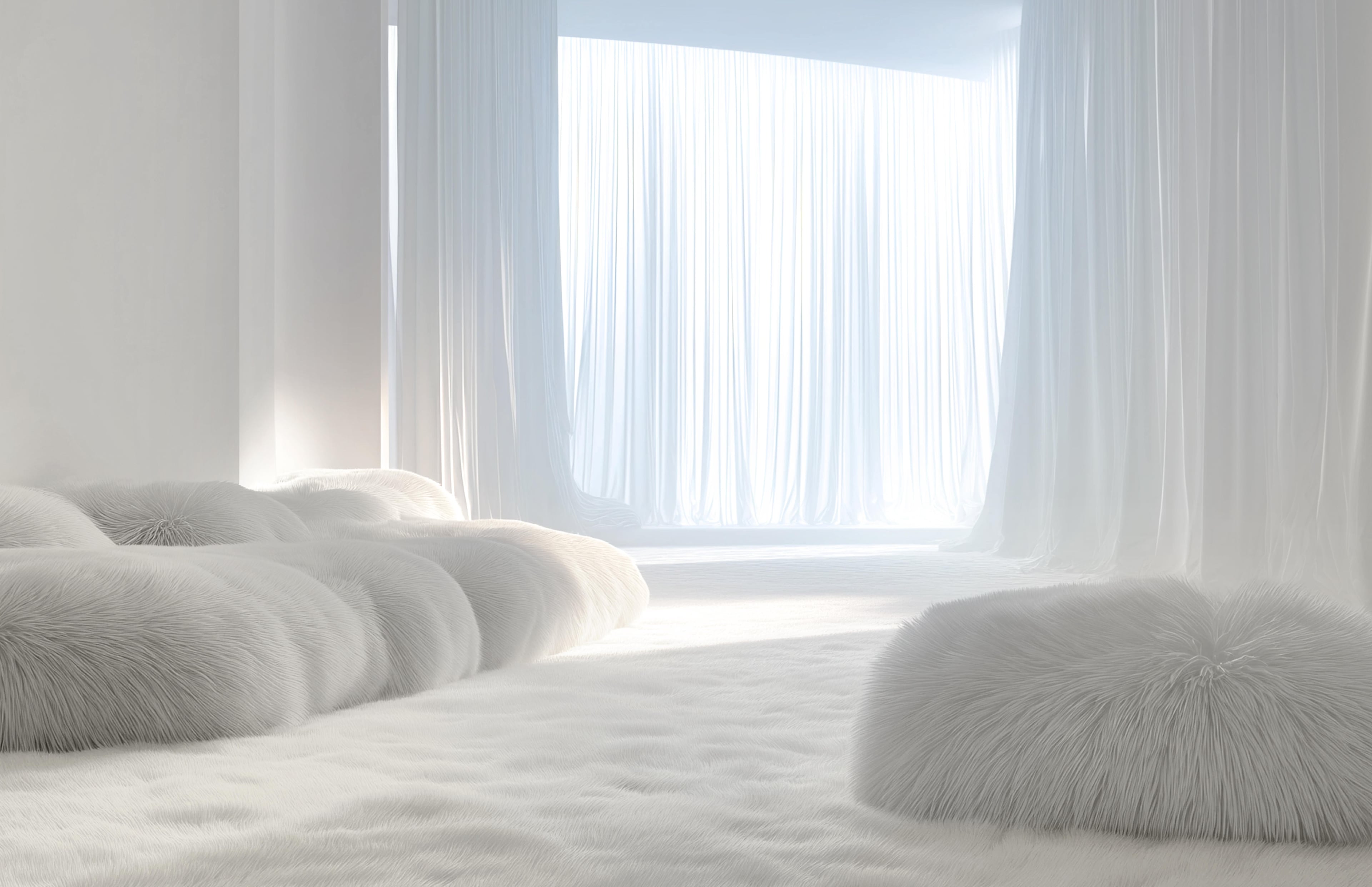
When Starr Simpson first heard that Pantone’s color of the year for 2026 was Cloud Dancer — a milky white — the interior designer was confused.
“I was like, ‘Wait, this is the actual color?’” she said. “I was actually very surprised by it because it just doesn’t feel like it’s current to this year.” Her confusion was gentle compared with the reactions on the internet that skewered Pantone, with some likening the choice to plain poached chicken to calling it the “landlord special.” It begs the question: Do Atlanta designers feel that it’s a color of the moment?
But first, a little Pantone context. The company was founded in 1963, and its system allows designers, manufacturers and brands to communicate color accurately across industries — it ensures that a particular shade of blue looks the same on fabric as it does on paper, for example. “Pantone is a color system that guarantees a color match in a print scenario,” said Whit Bolster, founder of the branding agency Ampersand, who calls the company “the gold standard.”

Each year, the Pantone Color Institute selects a color of the year that it thinks reflects the current mood and indicates what’s taking place in the culture of the moment. Pantone chose Cloud Dancer to represent an era of transformation, “a symbol of calming influence in a society rediscovering the value of quiet reflection,” according to the company.
For Bolster, the choice was a tone-deaf one. “Where I see design headed right now is analog-driven, textured, colorful and human. This Pantone color of the year feels like something AI spit out,” said Bolster. Generally, she added, Pantone picks a color that’s vibrant — think Viva Magenta, Pantone’s color of the year in 2023 — whereas white doesn’t reflect anything.
“As a designer of color who designs with a lot of color, my first thought was, ‘Oh my gosh, they didn’t even try,’” said interior designer Dawntoya Thomason. But after giving it some more thought, Thomason shifted her stance. “There are a lot of people that are gun-shy on color, so if you give them the right base, you can work color in around that,” she added.
Even in her own home, Thomason is using white in the living room she’s redesigning. “But, we’re going to wallpaper the ceiling, and the other things are going to be rich and deep,” said Thomason. “I think the way that a designer will be smart to use it is just to use it as a base and then put a lot of enhancements around it.”
Kristen Fountain Wilson of Studio Louise shared in the dismay at Pantone’s color choice, especially given what she’s observed among her clients. “Even the clients that prefer more of a neutral palette previously are coming back, and they’re saying they want a blue kitchen or green kitchen, or they’re trying to get away from the white,” said Fountain Wilson. She’s noticed that homeowners are more interested in trends such as cottagecore, known for its cozy yet colorful aesthetic, and color drenching, when the walls and ceiling are painted the same color.
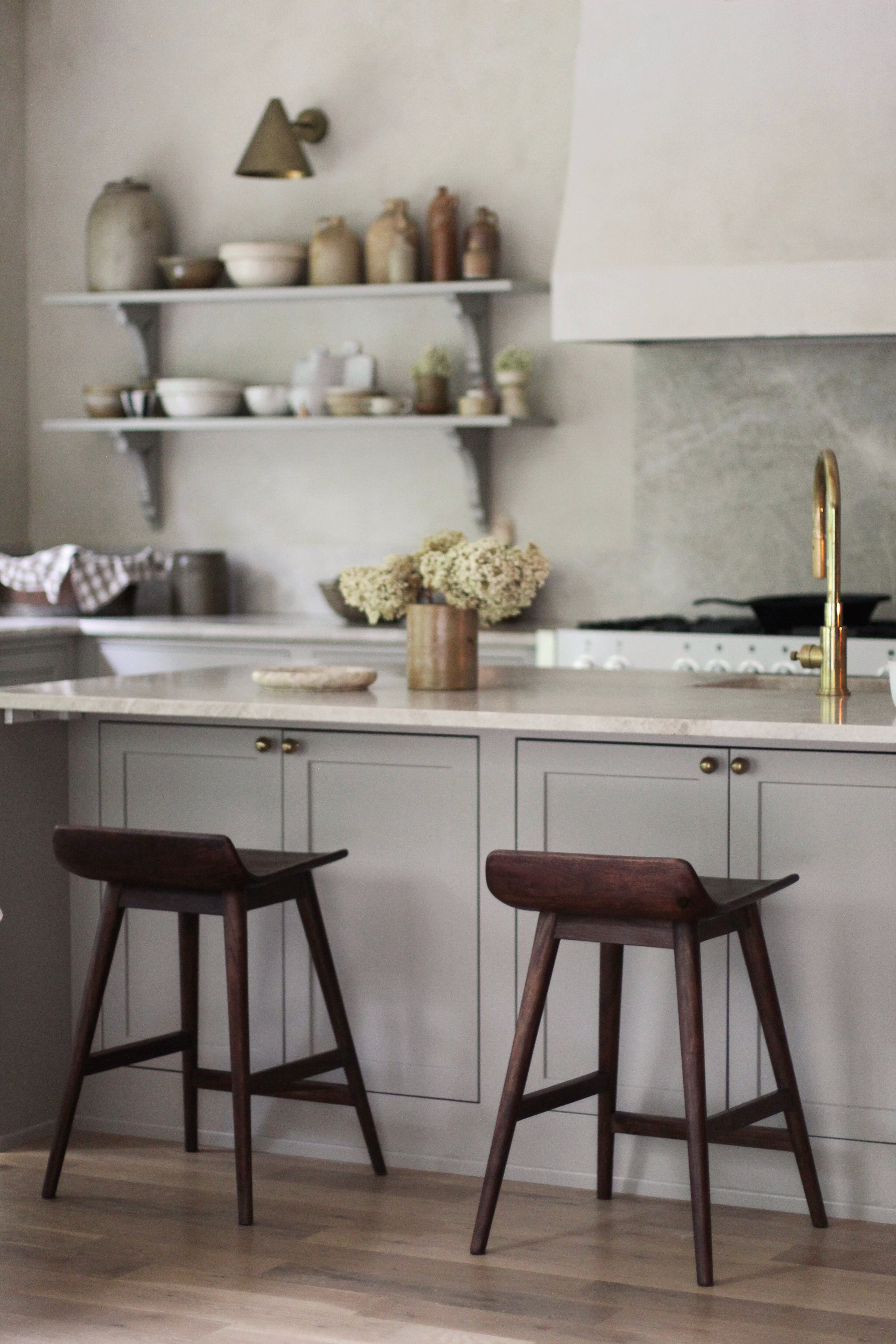
Fountain Wilson isn’t completely opposed to white, however. Like Thomason, she views it as a good color upon which to build layers. “There’s a reason that museums often have white as the wall color, because it is a nice backdrop that doesn’t scream at you,” said Fountain Wilson. “So I think it is a good neutral to stick to if you’re wanting to layer on.” She particularly likes white sheets and duvet covers topped with colorful pillows.
Simpson, the designer who thought Cloud Dancer was an odd match for 2026, likes using white to offset colors in secondary spaces. “So when you walk into your home, if the entryway is white, and it’s a really bright and open space, it allows you to use the other secondary spaces off that white hallway to bring in more personalized and color in those other spaces,” said Simpson.
Not all designers view the color as a misstep. As a Scandinavian interior designer, Hanna Soderstrom perceives the Cloud Dancer choice differently. To the Sweden native, it’s cozy and soft. “People are craving authenticity and those clean, calm surfaces that let us bring in the things we love,” said Soderstrom, of Home at Hand Interiors. “Almost like treating the home as a gallery, but in a warm, minimal, very livable way.” She also finds a renewed interest in Scandinavian design, which is known for its use of natural materials like light-colored wood and wool as well as neutral palettes and clean lines.
Soderstrom also pointed out that color is only one aspect of design. “Texture is becoming just as important,” she said. “We’re seeing more wallpapers, plasters and lime paints. People want materials that feel real and have depth.” Handmade zellige tile, for example, may be white, but its variation in size and tone gives a wall texture.
Whether a designer embraces Cloud Dancer or rejects it outright, most agree that one color shouldn’t dictate how a person outfits a home. What matters most is that a space feels layered, personal and human.
“People need to do in their houses what makes them feel comfortable,” said Thomason, the “designer of color” who works with a lot of color. “I would never want a designer to shame a client for wanting white. I think it’s our job to make that the best white wall with the best thing surrounding it. So no shame over here.”