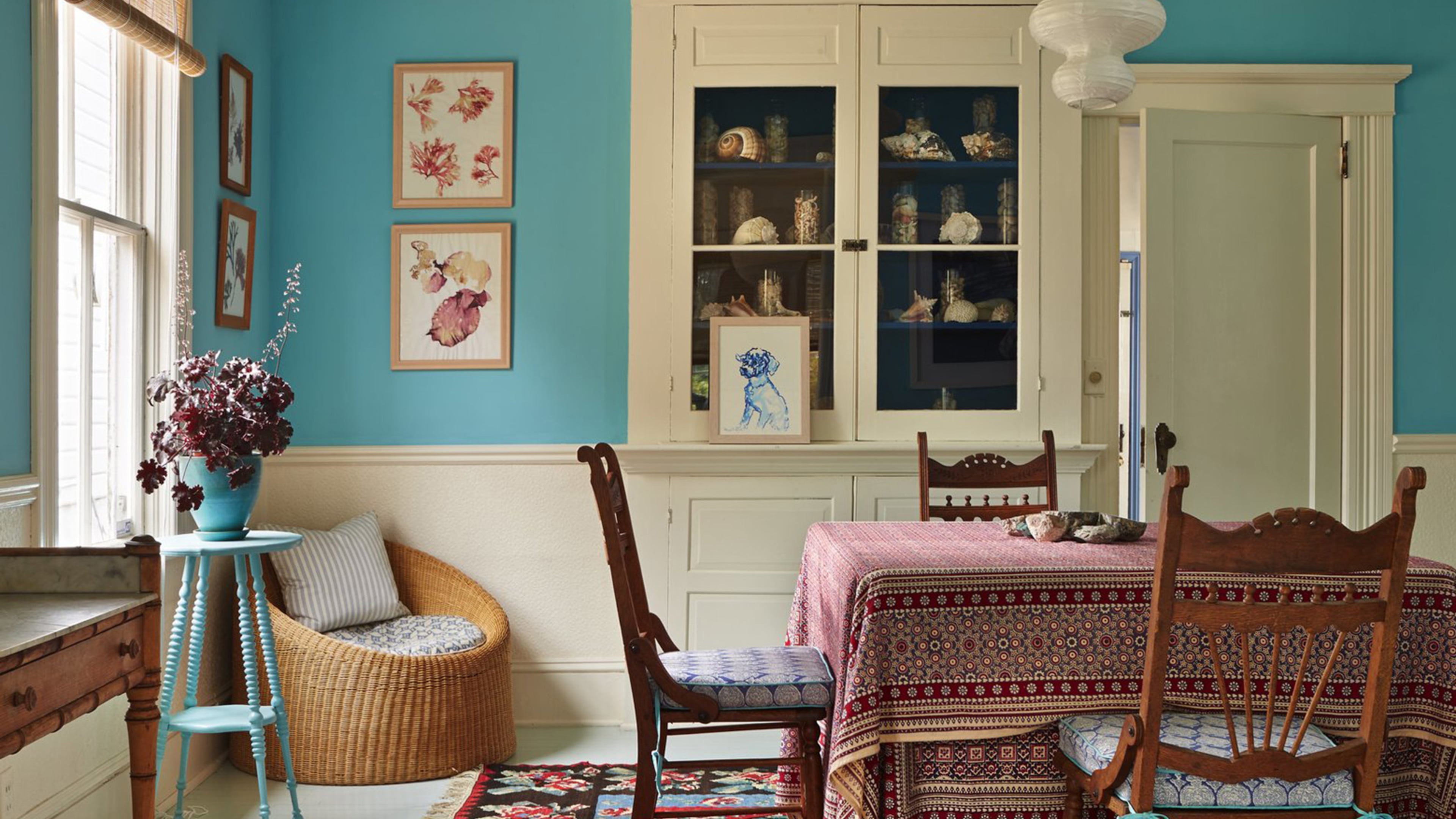
These are the buzziest paint color trends of 2017

There’s nothing quite like the feeling of a freshly painted room. Aside from its mood-boosting properties, paint has the power to transform any space with the flick of a brush. It can elevate your home, welcome in the new season, and even lower its value. But in a sea of swatches, how do you know what hue to choose? Paint can be a game changer in the best and worst way. In the same way the right tone can give a tired room a new lease on life, the wrong one can quickly date it.
So we tapped Farrow & Ball’s head of creative, Charlie Cosby, to finally answer the perennial question: What color should I paint my room? Now that we know what paint colors are out, it’s time to discover which hues the new year will reign in. While 2016 was all about black, gray and blush, 2017 is dialing it up. Expect bold, intense hues and vivid brights, which also happen to be some of Cosby’s personal favorites.
“I love Studio Green for 2017,” she told MyDomaine. “I love its depth and high intensity of color. Studio Green feels like a sleek black with a huge green undertone that adds a botanical feel. I’m also a huge fan of yellow and the optimism it brings to any space, particularly in such uncertain times.” Ahead, Cosby shares her top bold paint color trend predictions for the year, with some simple tips on how to use them.
EMBRACE VIVID BRIGHTS
The runways have spoken. Subdued colors are being replaced with vivid brights in our wardrobes, but it doesn’t end there. Expect to see these bold hues available as interior paint colors in 2017 too. “Brighter colors are becoming increasingly popular for the home, and we certainly saw bolder hues on the catwalks this autumn,” said Cosby. “Bright colors were also used in combination with sorbet shades at Tibi, Lacoste and Michael Kors, and this is certainly a trend that translates into interiors. Strong hues like St Giles Blue adds an electrifying accent to a soft sorbet palette of gentle blue such as Pale Powder and lilac Calluna. Similarly, rich aubergine Brinjal can be used in combination with the pretty Middleton Pink.
But the bold statement doesn’t end at color. Cosby says stripes are coming through in a big way. “Stripes are a design classic in both fashion and interiors, and we saw bright stripes coming through at the Marc Jacobs, Proenza Schouler and Opening Ceremony shows,” she said. “Whether you choose a multicolored stripe like our bold Chromatic Stripe, or simply hang a classic Closet Stripe horizontally, using stripes unexpectedly keep a room fresh and interesting for 2017.”
USE WITH CAUTION
Before you get excited about using these brighter hues, take note of the do’s and don’ts. “One of the biggest mistakes people make when choosing a bold paint for their home is choosing a color they will quickly tire of,” said Cosby. “If you decide to choose a bold color, then think about the colors you’re drawn to in fashion and the colors you already have in your soft furnishing, fabrics and accessories,” she explained. “You’re more likely to choose a color you love and, more importantly, one that goes with the home accessories and furniture you already have (although it could be a great excuse for a shopping trip).”
START SMALL
If you’re particularly cautious about dabbling in bright colors, Cosby advises starting with the smallest room in the house first. “Choose a vivid hue for a small bathroom, cloakroom, or even the inside of a cupboard is a fantastic way to add unexpected color,” she said. “Similarly, using bright colors as an accent to a neutral scheme is a good way to introduce color. Painting furniture in bold hues like Yellowcake, St Giles Blue or Incarnadine is a fantastic way to experiment with bright colors.”
PAINT WITH CONFIDENCE
When you do finally settle on “the one,” use it with confidence. This is Cosby’s number one rule when working with bright hues. “Any doubt will stick out like a sore thumb,” she said. “Either fully commit and paint a full room in a rich hue like Railings, Down Pipe or Stiffkey Blue, or deliberately paint a piece of furniture as an accent to an otherwise neutral space. Anything in between will lack confidence and be far less impactful.”
THE 5 BOLD PAINT COLOR TRENDS FOR 2017 ARE…
STUDIO GREEN
“There is something almost defiant about the use of botanic Studio Green on walls instead of the ubiquitous charcoal darks. It is unapologetically clubby and has a fantastically timeless old-world quality but can be used in the most modern of rooms.”
RADICCHIO
“Pink has been at the forefront of decorating for the last year, and there is now a natural progression to stronger reds, with their spirit of bold optimism. Radicchio feels exuberant, romantic, and sensual rather than clean or graphic, due to its complex underlying blue tone.”
HAY
“Understated Hay feels soft and familiar. Its quiet quality creates rooms that have a hushed atmosphere as well as an unmatched depth and gentleness. It is not a hot or sunny yellow (although it becomes rawer in bright light) but rather an aged, whimsical tone with an underlying green.”
DRAWING ROOM BLUE
“Drawing Room Blue is a strong, clean blue and reflects the nautical references we have seen on the catwalk, but with a more graphic feel. Our increasing desire to be surrounded by the humbling, calm of the sea brings serenity to the home.”
PELT
“There is a big feeling for ‘rock’ at the moment, with leather prevalent in homes and fashion. Luxurious Pelt is the perfect choice to add some color to a rock ‘n’ roll scheme.”
THE ALL-WHITE LOOK IS HERE TO STAY
If, unlike us, you’re not celebrating the emergence of bright, vivid and bold hues next year, then don’t fear. Cosby tells us the all-white look isn’t going anywhere. In fact, she believes it’s making a comeback. Although, for many of us, the timeless look didn’t go anywhere. “Recently whites have had an undertone of gray, but 2017 sees a return to a pure white that’s clean and graphic,” she explained. “Our All White has no pigment and creates an uncomplicated feel that’s naturally fresh, but not stark or ‘brilliant.’ The key to this look is to create a mood of stillness and calm by layering different whites, and only whites, together.” Check out Erin Featherston’s home to see this lovely white layered style in action.
Cosby loves to pair varying white paint colors together for visual interest. She loves Cabbage White and Strong White for this. “With their different nuances of color, they can be used in any combination with All White to create subtle decorative surprises,” she adds. “They also create the perfect backdrop for both art and natural materials. These seemingly simple colors evoke a complex response when combined in this way.”
In fact, Farrow & Ball’s most popular paint colors are white. “We are famed for our neutrals,” said Cosby. “All White, Wimborne White and Pointing are all our most popular colors. Neutrals are always popular as they can be used to provide a clean and inconspicuous backdrop to furniture, fabrics, artworks and accessories.” We’ll never give them up.
———
Get the latest on home decor trends, design ideas, shopping guides and food news, and take a look inside your favorite celebrity homes on DomaineHome.com.

